
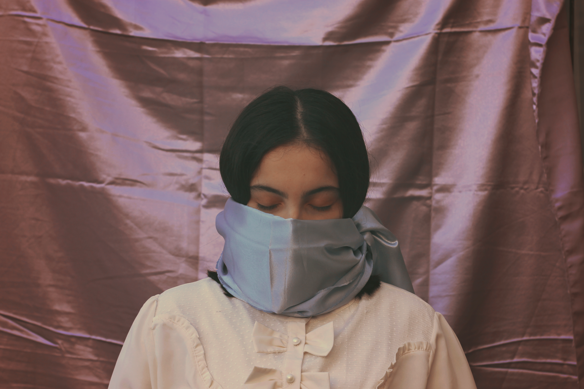
Of all the accessories in a well-dressed wardrobe, the silk scarf might be the most quietly misunderstood. Folded flat, it looks like nothing more than a square of printed fabric — easy to underestimate, easy to assume any version of it is basically the same. In reality, a genuinely well-made silk scarf can involve more design labor, more specialized printing technique, and more finishing skill than almost anything else in an accessories collection. The print is never just decoration; it’s the entire reason the piece exists, and getting it right is a far more involved process than most people ever consider.
It Starts With Original Art, Not a Stock Pattern
The best scarf houses don’t license generic patterns — they commission or create original artwork specifically for the format, often from illustrators, painters, or the fashion house’s own design studio. This matters more than it sounds like it should, because a scarf is a fixed, usually square canvas that has to work from multiple angles: folded into a triangle, tied around the neck, worn flat, draped over a shoulder. A composition that reads beautifully laid flat on a table can fall apart completely once it’s folded in half, which is why scarf-specific design is its own specialized skill, distinct from general textile or fashion print design.
Houses known for bold, maximalist prints — the kind built on saturated color and dense, layered pattern rather than restraint — tend to lean especially hard on this distinction, since a busy, theatrical design has far more room to break down structurally when folded than a simple geometric repeat does.
Turning Art Into a Printable Pattern
Once artwork exists, it has to be separated into individual color layers before it can be printed at all. Traditional silk scarf printing, still used by the finest houses today, relies on screen printing, where each distinct color in the design requires its own separate engraved screen. A scarf with a genuinely intricate, richly colored pattern can require well over twenty individual screens, each one needing to align perfectly with every other layer down to a fraction of a millimeter. Miss that alignment and the entire pattern blurs or misregisters — which is exactly why cheaper printed scarves, using fewer colors and simpler repeats, are so much faster and less expensive to produce.
Why the Fabric Itself Changes Everything
Silk isn’t a single uniform material — twill, chiffon, satin, and crepe de chine all behave completely differently under dye and print, absorbing color at different rates and producing different levels of sheen. A heavier silk twill, the classic choice for structured square scarves, holds crisp print detail exceptionally well and drapes with enough body to hold a knot or fold cleanly. Lighter silks produce a softer, more fluid result but can be less forgiving of printing errors, since the weave shows through more of the design. Choosing the right silk weight and weave for a specific pattern is a decision made well before a single color goes down, and it shapes the entire character of the finished piece.
The Finishing Details Nobody Notices Until They’re Missing
Once the printing is finished, the difference between a good scarf and an exceptional one comes down to details most people never consciously register:
- Hand-rolled hems — the finest scarves have their edges rolled and hand-stitched rather than machine-hemmed, producing a narrow, slightly irregular edge that lies flatter and resists fraying far longer than a machine finish.
- Color saturation and depth — high-quality dyes and proper steaming after printing produce genuinely vibrant, fade-resistant color, while cheaper processes often look flat or slightly washed out even straight out of the box.
- Pattern alignment at the border — on a well-made scarf, the pattern resolves cleanly at the hemline rather than being awkwardly cropped, which requires the original artwork to be designed with the finished edge in mind from the start.
- Weight and drape consistency — a well-finished scarf should hang and fold consistently across its entire surface, without stiff patches where extra dye or finishing chemicals have built up unevenly.
Why Bold, Maximalist Prints Are Especially Hard to Get Right
Some design philosophies lean into exactly the kind of visual complexity that makes this process hardest to execute well: dense, clashing color combinations, historical and theatrical references layered over each other, pattern built on pattern rather than a single clean motif. That kind of maximalist design vocabulary has deep roots in French fashion — it’s closely associated with the house Christian Lacroix, founded in 1987 with backing from Bernard Arnault, whose founder built a reputation on vivid, richly layered color long before the brand expanded into scarves and accessories in 1989. Executing that kind of density in a printed scarf, rather than a garment with more surface area to work with, is precisely the sort of challenge that separates a genuinely accomplished print house from one simply printing a pattern onto fabric.
For anyone curious what that level of pattern-making looks like in practice, Original Luxury’s Christian Lacroix scarf collection showcases exactly the kind of layered, color-rich design this article is describing — a useful reference point for seeing the craft rather than just reading about it.
What This Means When You’re Actually Shopping for One
None of this is an argument that every scarf needs to be a museum piece. But it does mean that price differences in this category are rarely arbitrary. A scarf built on original commissioned art, printed through a proper multi-screen process, finished with a hand-rolled hem, is doing meaningfully more work than a printed square from a fast-fashion accessories wall — even if, folded up in a drawer, they might look similar for a passing glance. Held up to the light and examined at the edge, the difference stops being subtle almost immediately.
